
The interface is the only brand
The unread guidelines
Somewhere there is a sixty-page brand guidelines document that nobody on the product team has read. Meanwhile, that same product team makes dozens of brand decisions every day without knowing it. The padding between elements. The tone of an error message. The speed of a transition. The hierarchy of a settings page. Each one communicates something about what this product is and who it is for. The brand is not the guidelines document. The brand is the sum of these decisions.
Every chain is a brand statement
Cause-and-effect chains make this concrete:
- Generous spacing → visual calm → control → trust
- Fast, snappy transitions → rhythm → confidence → competence
- Consistent placement → pattern recall → fewer errors → reliability
- Neutral palette → cognitive ease → focus on task
- Clear visual rhythm → composure → perceived control
The collection of all such chains, every cause-and-effect in the interface, is the actual brand. Not the logo. Not the color palette. The felt experience of using the thing.
Made by one hand
Vuokko Aro calls this the "Made by One Hand" principle at Monzo: every surface should feel like it was designed by a single intelligence with a single intent. Edward Thorndike's Halo Effect explains why this matters. When users perceive visible craft in one area, they infer invisible quality in others. A polished interface implies a secure backend. A sloppy interface implies sloppy engineering. The inference is not rational, but it is real and it is powerful. Visible craft is a proxy for invisible safety.
Promise versus delivery
The gap between brand promise and product delivery is measurable brand damage. A marketing page that says "simple and secure" above a product that is neither does not create aspiration. It creates distrust. Every moment the interface contradicts the promise, the brand erodes. Not in a brand tracker survey. In the user's body, in the micro-hesitation before they click.
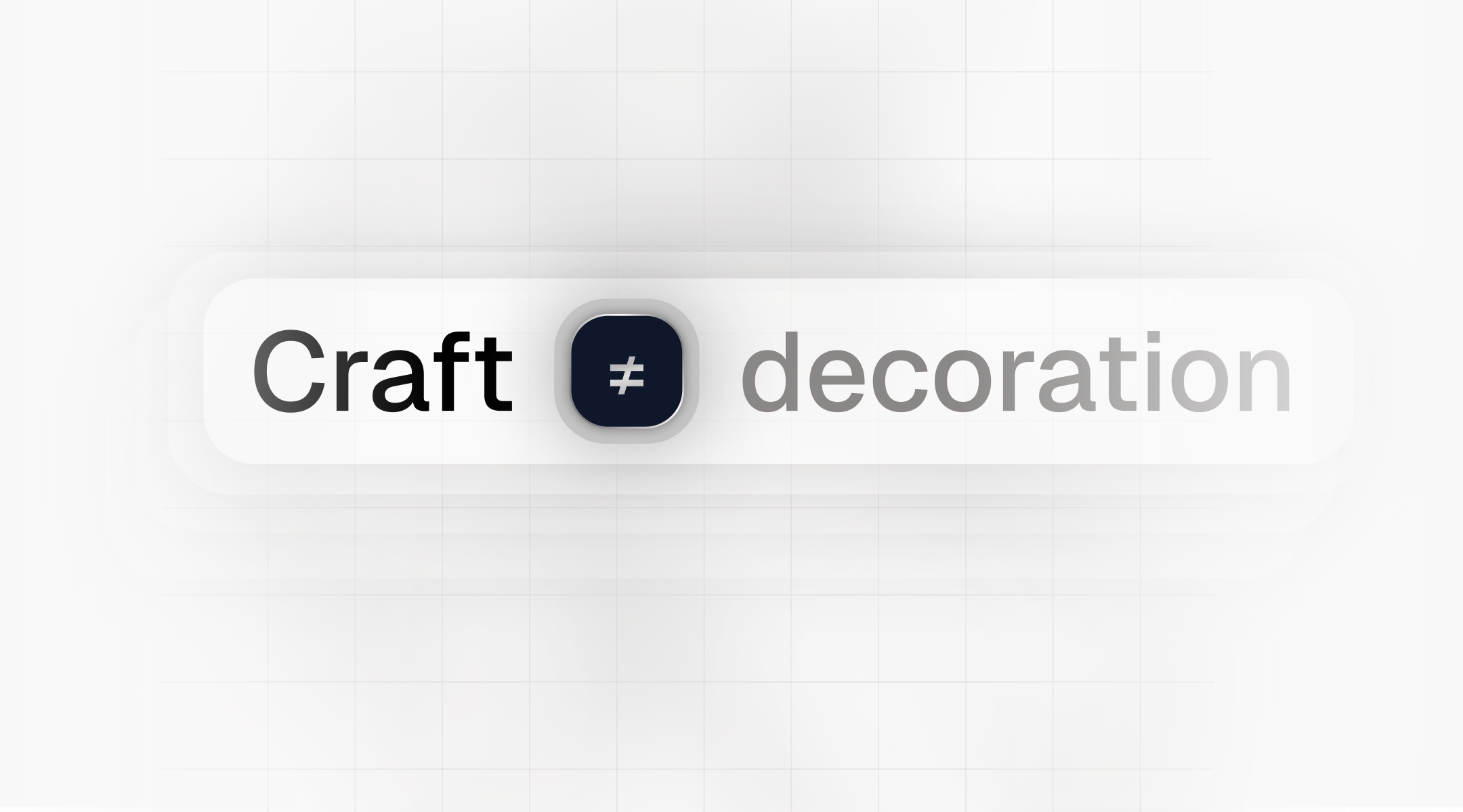
Craft converts
Stripe demonstrated this with numbers. An email redesign that elevated visual quality produced a 10.5 percent conversion lift. Quality to revenue. The craft was not decoration. It was conversion. The interface is the only thing the user touches.
Every decision on purpose
The interface is the only thing the user touches. Make every decision in it on purpose.